Oxygen-gtk version 1.1.0 will be out some time in June. It will come with a number of new features listed below:
- interface to dbus that allows on-fly update of the applications on configuration changes (as already documented here)
- a complete set of mouse-over and focus animations identical to what is available for the Qt version, and configurable using oxygen-settings. This includes smooth highlight effects of buttons, text fields, menu and menubar items, lists, etc.
- improved consistency with the Qt style: we finally implemented the same design as in Qt for named frames, and Ruslan Kabatsayev did a great job at implementing extended inner shadows in lists and text widgets. This is all illustrated in the screenshot below.
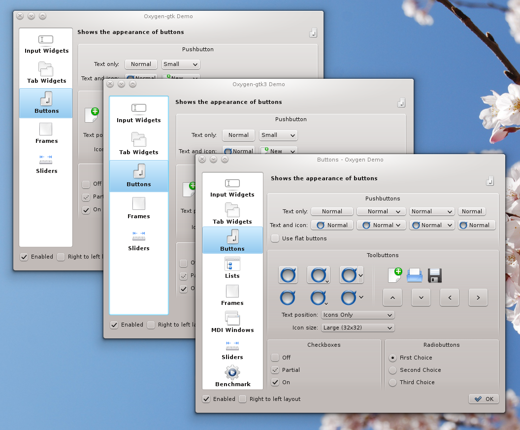
three toolkits, one widget style
2. Gtk3
Oxygen-gtk has been ported to the brand new Gtk3 toolkit, with practically no feature loss with respect to its Gtk2 incarnation. Despite GTK3's complete rewrite of the styling API, the porting turned out to be less painful than originally thought, notably thanks to the high segmentation of our code. From the limited set of applications we could test it on so far, this port is working quite well, as also illustrated in the screenshot above. Obviously all three windows are not pixel-perfect identical, and the metrics of various widgets somewhat vary from one toolkit to the other, but the overall consistency is quite satisfying, already, in my humble opinion.
Now, this is definitely not ready for release yet, notably because of the quite small amount of Gtk3-ready applications we could find on the web, for testing. Also, we had to seriously bypass (hack) the rather limited API of the new theming engine in order to be able to implement all features present in Oxygen's Qt and Gtk2 incarnations. Anyway, the code is available from our git repository using the command:
Now, this is definitely not ready for release yet, notably because of the quite small amount of Gtk3-ready applications we could find on the web, for testing. Also, we had to seriously bypass (hack) the rather limited API of the new theming engine in order to be able to implement all features present in Oxygen's Qt and Gtk2 incarnations. Anyway, the code is available from our git repository using the command:
git clone -b gtk3 git://anongit.kde.org/oxygen-gtk
3. Shadows
We've been collaborating with KWin dev Martin Graesslin on a new shadow system that let the widget style render the shadows for menus, tooltips, drop-down list, etc. This new feature, also documented here, allows Oxygen to render the same shadows for the widgets listed above as for normal decorated windows, thus improving consistency. The result is illustrated in the next two screenshots, first for a Qt application, second for a famous XUL + Gtk application. Note notably how the menu in the second screenshot have square corners, due to an XUL limitation, and how we adapt the shadow rendering to that case, something which was not possible in the past.


Finally, for the first time I'll meet in person with Nuno in a couple of days, and we'll take this opportunity to revisit (and hopefully improve) the last few UI elements with which he is not so happy today. In the process of doing so, we will notably incorporate some quite useful input from Dolphin dev, Peter Penz.
All the above should become available to everyone by the time KDE-4.7 is out, so stay tune.
All the above should become available to everyone by the time KDE-4.7 is out, so stay tune.
I like oxygen-demo, but would be more interesting to an oxygen-setting-gtk? and thus make it a completely independent theme.
ReplyDeleteI use xfce, and would like to modify oxygen, without kde, although it is editing files.
Thanks.
And regards.
Matias
p.s.
ReplyDeleteTry to do something, but I find no information about the kde configuration files (Colors for example), nor those of Oxygen (Shadow, arrows, etc)
Some information to help me?
Please, consider adding a little padding to widgets, and make sure that padding is consistent at every side of buttons/input widgets.
ReplyDeleteFor example, compare Chrome's and Rekonq's address bars with url in them at higher zoom levels and see what I mean. See how above buttons with no icons appear so tiny in height. Also, the ones with text and icon have different padding on left, top and bottom.
I don't know it this a QT4 or Oxygen thing but lack of consistent and symmetric padding in all kinds of widgets is currently the number one visual problem in KDE imho.
Thanks!
Hug Nuno from me! :)
ReplyDelete@Matias
ReplyDeleteoxygen-demo and oxygen-settings fulfills two totally independent functions. The first is for *me* (its a debugging tool). The second is for users. So, quite unrelated. right ?
For now we have focused on KDE integration. In this context, there is no need for an oxygen-gtk-settings, since it is 100% redundant with existing oxygen-settings. Whereas there was a need (for me) of an oxygen-gtk-demo.
Focusing on oxygen-gtk as a standalone theme that runs on other DE will likely be the focus of the 1.2.0 release. Then it will make sense to work on what you ask.
In the meanwhile, if you want to give it a shot on your side, the two configuration files that are loaded for oxygen-gtk (and Qt) are in your
$HOME/.kde/share/config/
They are:
kdeglobals
oxygenrc
We actually provide two local copies of these files with oxygen-gtk (in oxygen-gtk/rc), though I'm not 100% sure that they are up to date.
These two files are usually installed in
/usr/share/themes/oxygen-gtk/gtk-2.0/
@Amiroff
ReplyDeleteThe padding is likely the most subjective thing amongst user for the style. Depends on how you run applications (full screen or many at once), on the size of your screen, on your personal need for air, etc. For a long long time we've had everlasting complains about oxygen wasting too much screen estate, and have been hunting pixels (quite the opposite of what you ask).
So since no concensus could ever be achieve on that, lets leave it to Nuno to decide, in a non democratic way.
@Amiroff again:
ReplyDeleteAs for consistent padding and alignment across Qt widgets, screenshots and bug reports would help.
It is likely that some of the issues are Application specific, that some other are definitely oxygen's fault (best way to figure it out is to use another style and see if the problem persists), and some are probably Qt's.
For instance some widgets which would appear perfectly aligned with one font + font-size would fail with a different font + font-size. (Trust me, and give it a shot :))
I use Deja-Vu sens, with size height, and things look quite decent here. (but now again I might have missed some).
I have spend literally hours, between kde4.4 and kde4.5 to improve the situation, as a matter of fact (though I am not claiming that it is perfect now). It was actually one of the purpose of the oxygen-demo application to test alignment and padding between widgets.
Will it be a way to combine oxygen-transparent and oxygen-gtk in the future? In other words, would it be possible to have a oxygen-transparent-gtk at some point, so all apps (qt and gtk) appear the same when using a not completely opaque oxygen-transparent style?
ReplyDeleteThis is the problem I see now using oxygen-transparent, that you loses most of the benefit from oxygen-gtk.
Thanks in advance
@Salva
ReplyDeleteit is possible, and is on the todo list, also for the 1.2.0 release (so: not tomorrow), but will only work for a quite limited number of gtk applications, be cause many many gtk applications simply crash (or display garbage) when passed an alpha channel. (this was the main issue for the 1.0.0 and 1.0.1 release of oxygen-gtk, for which we used alpha channel to get nice rounded corners in menu).
Also, this will never work for applications like firefox (and all XUL based apps), openoffice/libroffice, opera, and a number of other apps, due to Gtk binding limitations (to XUL, wxwidget, etc.)
great work :)
ReplyDeletePS those square corners are really sexy! can we get oxygen-setting to enable this corners globally to oxygen style? in my opinion oxygen would get some sharper look :)
@Yoda
ReplyDeleteNo there is no available option to enable square corners anywhere. The use of rounded corners for menus and lists is a (strong) design choice; it is consistent with the window decoration, and with all UI elements, in fact. So we enforce using them everywhere we can and only fall back to square corners when there is no other way (firefox, openoffice, etc.)
As for oxygen needing a sharper look, I don't disagree (nor does Nuno) and we are working on it. But the sharpness we envision is more a question of well managed contrast than round vs square corners.
@Hugo
ReplyDeleteOh ok :) I didn't meant to force a oxygen overhaul, it just would be great to see option to choose corner style - something like tab style (single/plain) where user can decide which one he/she prefer, but now I gues it's more like reworking whole style then just add another option?
What a pity it's impossible for me to participate in your. I'm quite far from you ;)
ReplyDeleteAnd Dolphin is a great example of an interface that is good, but could really become much better. The misalignment issues in there really do bug me whenever I look at it. Hugo, what do you think, could we discuss Dolphin as an example of Oxygen interface on IRC sometime? I'm no UI expert, but, well, kinda have some sense of beautiful :) You know.
--thorGT
Oy sorry, "in your meeting" above :)
ReplyDelete