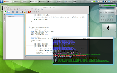
- improve alignment between widgets
- make borders sharper, visible notably in menus, comboboxes, MDI windows (although they are largerly unused)
- fix glitches where widgets would interact one with another (notably in tabbed view)
Note that we did change the buttons a bit (based on the huge feedback from the previous post), in a subtle way that will for sure not make everyone happy (this you can never achieve), but hopefully won't displease people who liked them already, and will satisfy some of the people who complained.
As discussed in other posts there are new features though:
- more widget animations
- more configuration options, using oxygen-settings (give a try to follow-mouse animations for menus, menubars and toolbars, for instance)
- the ability to move windows by clicking in empty areas
What we have in mind for kde4.6 (in arbitrary order of preference, and without any guaranty of having any of these actually implemented):
- support for consistent transparency (+blur) in the style and the decoration
- support for sideways decoration title
- having a Qt-only oxygen style (because I wish my Qt apps running on windows could use oxygen without having to install the entire kde suite)
- on the tech-side: optimization of pixmaps caching in the style (because it seems to cause problems to some users)
- and of course (with highest priority): bug fixing and optimization
 kcalc and desktop settings
 Dolphin and Amarok
 Konsole and Kate